The existing tool was technically robust, but the experience didn’t match the complexity it was trying to manage.It required users to navigate dense questions, unclear flows, and heavy documentation — all while trying to make critical architectural decisions.
At the same time, there was a need to:
- Introduce automation wherever possible
- Keep the framework aligned with real business use cases
- Provide a sense of guided expertise during the process
- Modernize the UI without breaking familiarity
Because if the tool feels difficult… it doesn’t get used.

Research → Deconstruct → Structure → Design Flows → Validate
Spoke to 10+ users (22–56 yrs) across:
What came out of it:
AI in the Process
Used AI to speed up pattern analysis and competitor research.
Helped move faster — not think less.

Key Design Moves
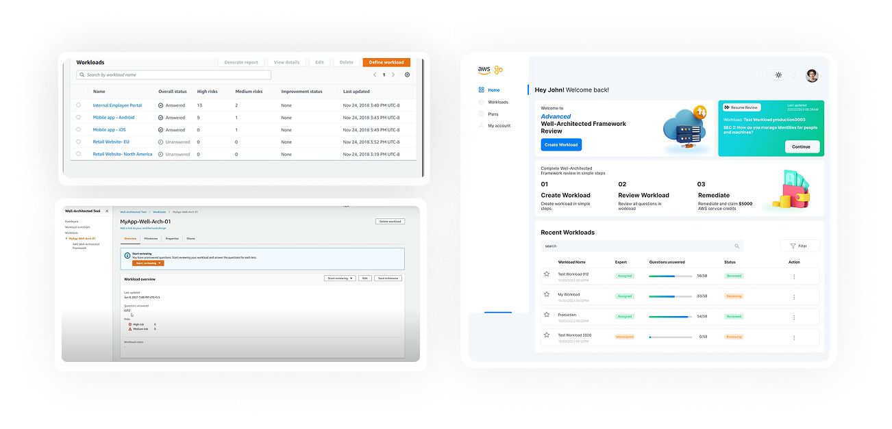
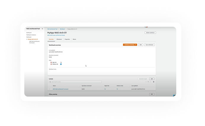
Before
Clean landing page
Simple steps descriptions in how it works
Workload list with progress visual cues
Resume last review
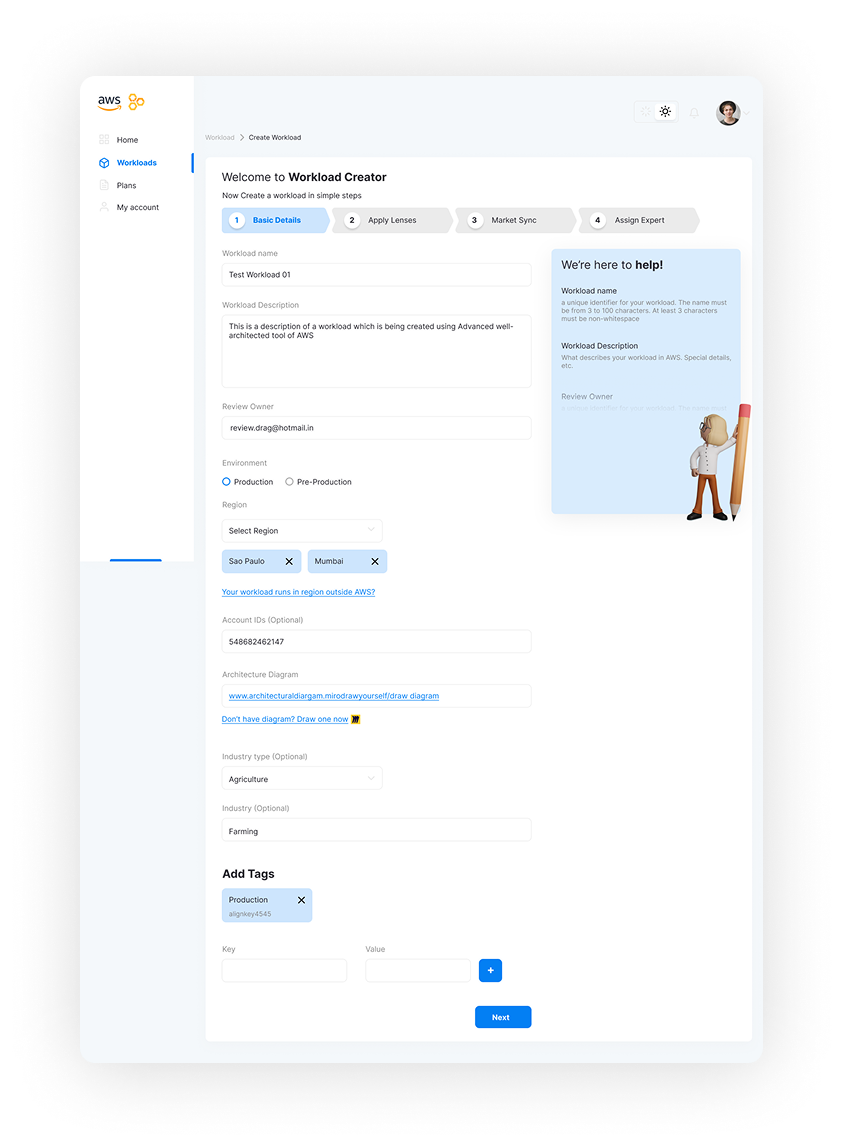
Before
Clear view of Progress and logical grouping
Addition of AWS Expert
Addition of Market sync
Help box addition to fill the form efficiently
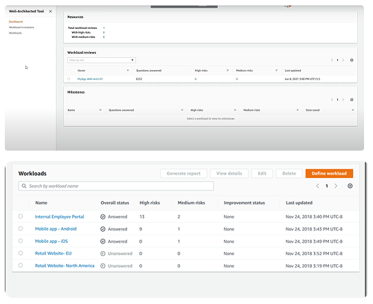
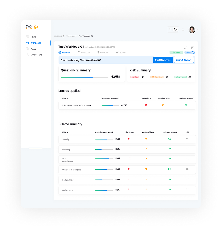
Before
Improved Visual hierarchy
Progress visual cue
Similar structure to original (Jacob’s law)
Sidebar addition for documenting additional data
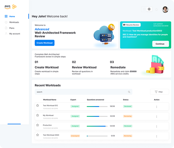
Before
Clean landing page
Simple steps descriptions in how it works
Workload list with progress visual cues
Resume last review
Before
Clear view of Progress and logical grouping
Addition of AWS Expert
Addition of Market sync
Help box addition to fill the form efficiently
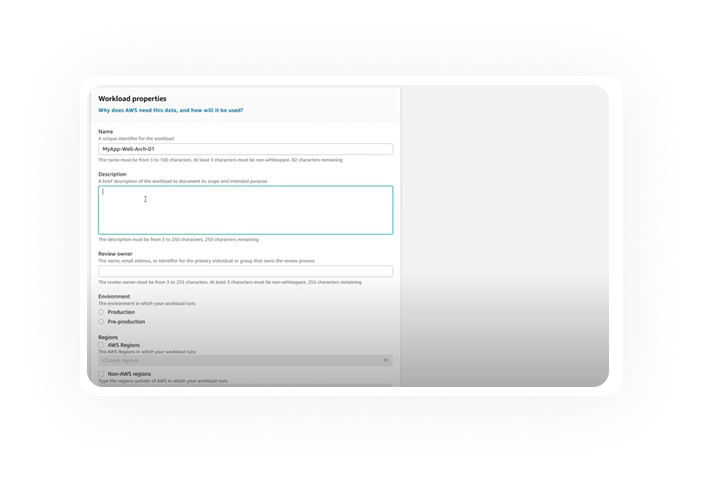
Before
Improved Visual hierarchy
Progress visual cue
Similar structure to original (Jacob’s law)
Sidebar addition for documenting additional data