LedgrLens
A pre-accounting layer that turns receipt chaos into a system SMB owners and their CAs can both trust.

Business owners lose receipts. CAs spend hours chasing them. Accounting becomes a mess of WhatsApp screenshots and half-remembered expenses. On both sides.
No dedicated tool exists for the layer between daily bookkeeping and the actual audit. Businesses fall into this gap every single year, scrambling at the last moment with no system to show for it.
Every audit cycle, SMB owners spend days finding receipts, reconciling statements, and answering the same CA questions: work that adds no analytical value.
Chartered Accountants spend billable hours on document-gathering and chasing down evidence, not on the analysis and advisory they were hired for.
Existing tools are either full accounting suites (too heavy) or receipt scanners (too narrow). LedgrLens owns the preparation layer: the distinct, designable space between daily finance and the CA's arrival.
“My CA keeps asking for bills I can't find.”
“I need everything in one place before I can start.”
Here a primary research was given to the team for analysis and gathering insights. Based on all the user interviews, data and context we came up with 3 major insights that needed action in terms of the solution.
The handoff is the biggest failure point. Both sides wanted to do their job — but the process of passing data from owner to CA was entirely broken. No structure, no format, no accountability.
Mobile capture was necessary. Business owners are always on the move. Any solution requiring a desktop to log expenses would fail. Camera-first was non-negotiable. We kept the desktop log, but created a mobile capture for this specific requirement.
CAs don't want to learn new software. They want familiar, structured layouts. The CA portal needed to feel like a logical upgrade — not a disruption to their existing mental model.
Made the business entity, not the user's account, the root context and workspace of the application.
Avoiding confusion since there are multiple entities for business owners.
Left pane shows social proof, right pane is the functional form.
Auth screens are the first impression — showing real product value on the login sets expectations.
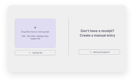
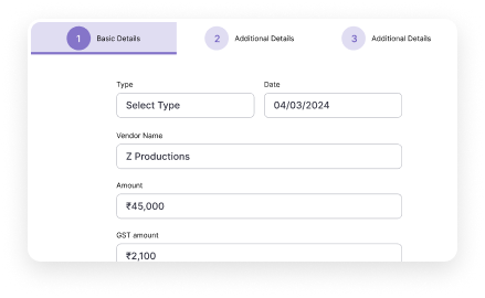
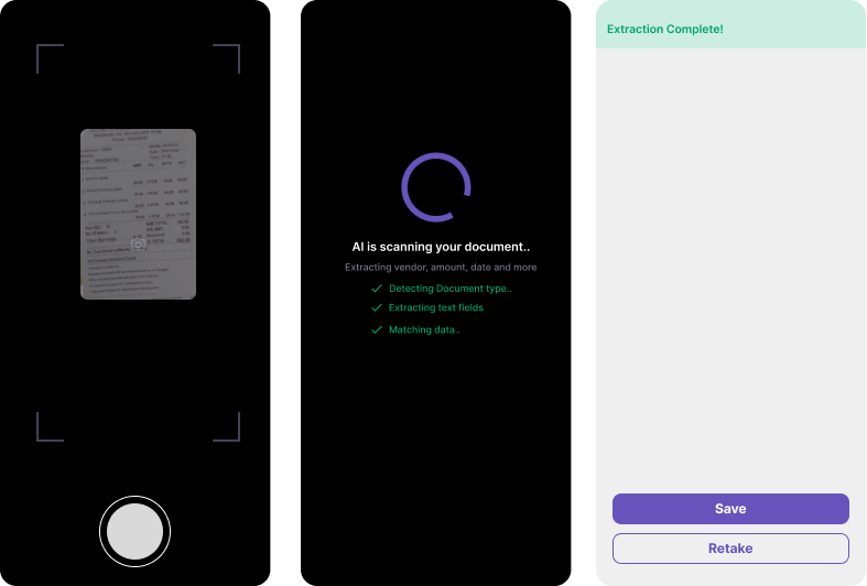
All optional fields removed from the capture path. One tap to photo, one tap to save.
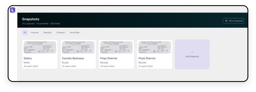
Capturing snapshots is the first ‘aha’ moment in the product — there should be no blockers during it.
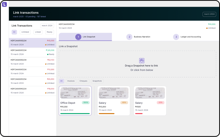
Every feature was evaluated against one question: does this help users get to MoneyLink faster?
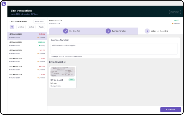
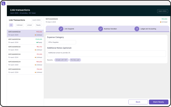
Link Transactions is the ultimate goal for the SMB owner before handoff to the CA.
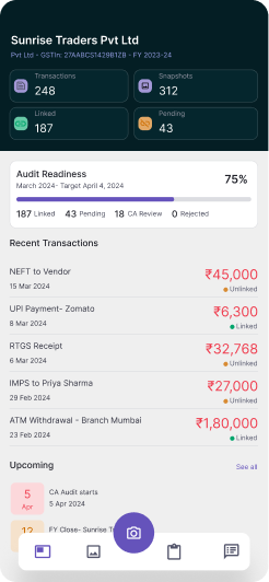
Research revealed business owners collected receipts throughout the day: between meetings, at vendor sites, during petty cash runs. A desktop-only product meant documents were lost before they were ever filed. The mobile surface is a scoped companion: Evidence capture, read-only awareness and messaging. Nothing else.
Link Transactions, entity setup and CA dashboard are excluded.
Tapping snapshots opens the camera directly — zero steps between intent and capture.
Account creation is blocked on mobile with a clear redirect to desktop. No half-finished onboarding.
01 — Snapshot Capture: The aha moment


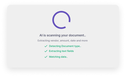
Every optional step was removed from this path. The insight: the aha moment isn't a feeling. It's a specific animation at a specific duration, designed to answer one question: did that save?
The flow is optimized for one handed use between meetings. Got it wrong? Retake is one step away!

02 — MoneyLink: The north star


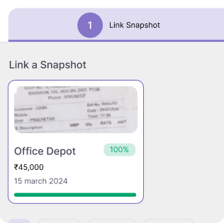
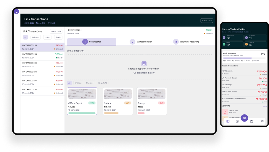
Documents on one side, bank transactions on the other. The user's job: confirm what belongs together. Drag-to-link made reconciliation feel physical, not like filling a form. The insight: MoneyLink is what the product is for — it needed to feel that way from the first interaction.


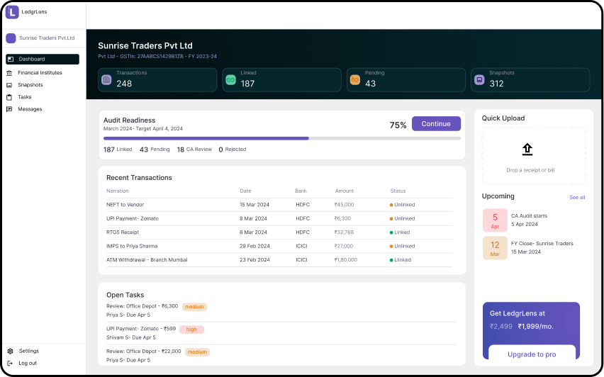
03 — The Dashboard: Actionable by design


Business owner: audit readiness, unlinked transactions, CA messages — in that order. CA: clients sorted by outstanding actions, not alphabetically. The 8am check answers itself. The insight: a dashboard that prioritises everything prioritises nothing. The product does the triage. The user does the work.
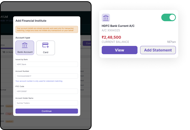
04 — Security Throughout: Designed trust
No warning walls. No consent fatigue. Bank connections, CA access grants, and data exports all shared a consistent visual treatment: a distinct surface, deliberate copy, clear confirmation. Sensitive states looked different. Users learned to recognise them without being taught. The insight: trust isn't built by what the product says about security. It's built by how the product behaves at every moment that involves sensitive data.

The original product made manual tasks faster. An agentic layer would eliminate most of them.
This tool was built in 2021. Here's how I'd design it today.

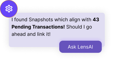
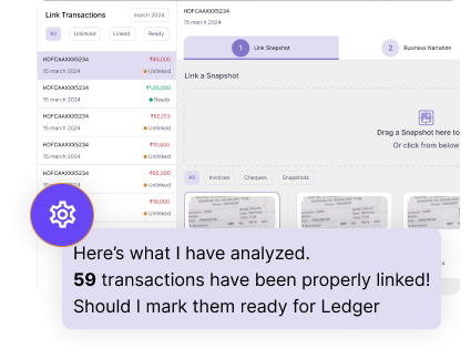
The agent matches evidence to transactions above a confidence threshold and presents a summary for one-tap approval. The user stops linking — and starts reviewing. Estimated time saving: 20 min → 90 sec per reconciliation session.

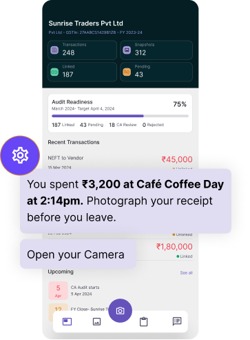
A debit appears. No receipt is found. The agent sends a targeted notification within minutes: “You spent ₹3,200 at Café Coffee Day at 2:14pm. Photograph your receipt before you leave.” The receipt is still in the user's hand.

Before the CA opens a client's period, the agent has already read it. They see a 4-line summary: reconciliation status, anomalies flagged, missing evidence clusters, unusual spend compared to prior periods. They still do the accounting. The agent does the reading.
Thanks for watching! Connect with me to know more about this product and much more.